
36th Parallel Coffee Postcards
Creative Advertising | Art Direction | Brand Campaign
36th Parallel Coffee Roastery is a gourmet coffee company based out of Melbourne, Australia. 36th Parallel artisan coffee is roasted weekly in Melbourne. Their fresh-roasted coffees are specialty-graded, fairly traded, traceable to the farm/co-op level, and eco-friendly. As for this conceptual advertising campaign, these postcards are dedicated to the brand's highlight product - 36P Coffee Pods, made from plant-based materials which are fully biodegradable and compostable.
In order to bring the brand's values closer to its audience, I received a brief to create a postcard campaign for 36P Compostable Coffee Pods. The key visuals of these postcards included the iconic Melbourne's features captured through the lens of 36P - fresher, greener, but still, classic and vibrant, hoping to draw a stronger connection with the audience.
 |
|---|
Challenge
How might I transform and reinforce the brand essence in the simplest and unexpected way of using inderect advertising in order to catch the attention of Melbourne home coffee machines owners who appreciate good coffee, but are environmentally aware, and encourage them to keep these postcards?
Insights
-
Most customers enjoy the 36P Compostable Coffee Pods due to the rich taste of Melbourne specialty coffee and the eco-friendly capsules.
-
The brand offers “that undeniable taste showcasing the Melbourne roasting scene to the world”.
-
The compostable capsules are the product representing the brand’s core value in “striving for a sustainable future with no compromise to freshness”.
With the three statements serving as the foundation for me to better understand the why of the single-minded proposition: "Enjoy great Melbourne coffee with a clear conscience”, and expanding the initial concept layout, I was finally able to identify the solution.
Idea and Concept
ORGANIC VERSIONS OF MELBOURNE ICONS
The idea’s definition for this campaign is about the organic versions of Melbourne’s icons accompanied by the key visual - 36P coffee capsules. Based on the insights above, this idea can complement the brand's exceptional aspects of "providing original Melbourne coffee" and "encouraging sustainability for our planet" by combining images of coffee capsules and classic Melbourne sights with a tweak of natural materials. Additionally, it also inspired the creation of intriguing pieces of communication that could catch the audience’s attention and connect those insights to them.
 |
|---|
Taking in consideration the fact that our once-lively city has been “falling asleep” for a long time due to the pandemic, I wanted to transfer a feel of reminiscence to make this concept more relatable to the contemporary situation when the citizens of Melbourne are longing for the day the city revives and reunites. Therefore, the main influence behind the decision of every piece of the “visual pie” was my choice of Melbourne's icons including the Star Observation Wheel, City Circle tram and Melbourne Central tower. The chosen figures are ones that can integrate with the capsule's visual without making it too obvious, and most importantly, embrace the significant Melbourne's experiences that have been neglected in the rushing flow of the citizens' daily life.
Choosing these sights as the postcards' representatives not only helped deliver the desired brand impact - displaying Melbourne's unique scenes with coffee specialty - but also generate the sense of nostalgia that this common item for a souvenir commonly delivers. Moreover in a brand perspective, it can be seen as a comforting gift conveying a sense of empathy and supportiveness to our audience, which can encourage them to treasure these design pieces as a reminder of our vibrant city.
 |
|---|
 |  |
|---|
 |
|---|
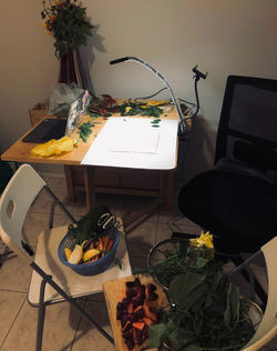
Execution
Having the solution and art direction finalized, I reached the final stage of this campaign - production. During this stage, I had the opportunity to tackle some challenges consisting of keeping on track with the timeline of photoshoot and editing, as well as displaying and composing pieces of props to form the installations cohesively. Below are some pictures of this campaign's behind the scenes.
 |  |  |
|---|---|---|
 |  |  |