PINEAPPLE
Social media strategy and brand's mascot
WHAT I DID
Creative Direction
Marketing Strategy
Client management
Internal audit
Competitors landscape
UI/UX design (minor)
SOFTWARE
Photoshop
Illustrator
After Effects
InDesign
Figma
Pineapple is an Australian start-up led by experienced ex-bank executives, intrapreneur Luke Campbell, and successful entrepreneur Kari Marsden. They believe managing money can be made simpler and easier and that’s why they’ve created Australia’s first financial wellbeing wallet to help young Australians be better with money.
At the beginning of 2021 when the team was working towards testing and building out features for a full-scale launch later in the year, I joined the crew as a Digital Design Intern to help strategize and establish an impactful visual style for branding and engaging content for their social media marketing in order to attract and interact with the target audience. The workload consisted of social media templates, branding characters, and a series of flyers to call out for product testing participants.
WHOM I WORKED WITH
Luke Campbell - Kari - Sushmita Deb

Australia's first financial
well-being wallet
"Our aim for the visual designs is to balance between the playful and trustworthy tone of a financial service dedicated to young adults in Melbourne."
- Luke Campbell, Founder of Pineapple
Based on the existing branding materials, there was a lack of cohesion and expressive voice resonating with the adventurous personality of a Hero brand type across different channels. My challenge was to find a suitable visual style that could represent that bold characteristic of the pioneer in financial wellbeing expertise and carry it into the brand's graphic designs.
 |  |  |
|---|---|---|
 |
Understanding the client's point of view and adopting the insights gained from existing user research, I experimented with the color gradience and grid system to visualize the adventurous characteristic that was the mutual connection between two parties - the brand and the audience. As a result, the established visual style breathed a bold yet contemporary spirit through various blends of the brand's color scheme which could be applied and expanded to multiple channels.
 |
|---|
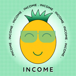
As I looked at the current newsletter and product design, the simplicity in UI/UX design put a limitation on the distinct boldness, disconnecting to the playful tone of the copywriting part. Therefore, while benchmarking their competitors' digital marketing performances, I found a feature from Up bank highlighted due to the effective brand strategy - the rectangle character based on the company's logo. After discussing with my client, we agreed to experiment with creating our illustrated "representatives", playing as communicators interacting with the users in visual designs for the web app and social media marketing.
 |  |  |
|---|---|---|
 |
 |  |  |
|---|
Understanding the client's point of view and adopting the insights gained from existing user research, I experimented with the color gradience and grid system to visualize the adventurous characteristic that was the mutual connection between two parties - the brand and the audience. As a result, the established visual style breathed a bold yet contemporary spirit through various blends of the brand's color scheme which could be applied and expanded to multiple channels.
 |
|---|